

Business Intelligence Tools
What I Learned: Leveling up my Tableau and Power BI skills
This week I took two courses on Tableau, and one on Microsoft Power BI to help supplement what I already know about BI tools. This blog essentially serves as notes from the courses I took this week, to help me make sure I have really understood what I learned and will be able to apply it again in the future. Much of the below is quite intuitive, but I figure it can’t hurt to condense and organize my notes again!
Tableau
Data
- Data should be in tidy or long format.
- Tableau can connect to many different data sources. CSVs are considered text.
- Tableau can work with PDF data. In this case, each page is considered a separate table that needs to be joined with a union.
- The Data Interpreter can help clean up wonky data, but it is important to review what was done to make sure Tableau interpreted the original data correctly.
- Extracting data creates an “extract” for Tableau to work from, meaning that the data is now in a separate Tableau-specific file. This way, changes to the original data won’t impact what is used in Tableau, which is useful for large/dynamic datasets.
- Data can be filtered on the row level using the Filter button on the top right.
- Columns can be deleted (hidden), split, renamed, etc.
- It is possible to do simple pivots from within Tableau.
- Note that if you try to pivot with columns that are totally empty, Tableau will think they are character columns and throw an error. To avoid this, just hide them directly or remove them from the metadata table.
- With a large dataset, pivot may take a while. To make it go faster, a trick is:
- Apply a data source filter to only grab some rows.
- Pivot the table.
- Create the visualization.
- Remove the filter at the end to add back in all of the data. Do this by right clicking on the data set > Edit Data Source Filters > select filter > click Remove
- Joins are possible by simply dragging multiple tables next to each other in the Data Source pane. Can select the variables to join on and the type of join.
- Blending is an alternative to joins which can be done on the fly without needing an explicit join. This might be useful if we want to avoid data aggregation. Blending is a “smart” kind of left join, so it is relevant which table is set as the primary table.
- To adjust where to blend if Tableau doesn’t automatically recognize the fields (like if they have different names), this can be done via Data > Edit Blend Relationships. Or, just change the field names to match.
- Blends won’t automatically happen unless the relevant fields for the blend are included in the visualization. Add to the detail field or press the paperclip to get around this.
- Note that blends are done on a per-sheet basis.
- Blends require that all items calculated fields be aggregated, because data are aggregated to create the blended table.
- Data can be organized in the Data pane into folders (which you can create) or by table.
Basics:
- Tableau uses an intuitive drag-and-drop interface for creating visualizations.
- The order of items in the rows/columns fields impacts whether they are in the foreground/background.
- Categorical variables are called dimensions (specified in blue) and continuous variables are measures (green).
- Tableau will automatically generate a count measure.
- Sometimes variables (like dates) will be considered dimensions and need to be manually changed to a measure to disaggregate (useful for time series).
- Data will be aggregated at the “level of granularity” (e.g., student/class/school/district/state/country etc.) of a particular worksheet by default. Disaggregate by clicking Analysis and unchecking Aggregate Measures.
- It is possible to change the aggregate function on a measure through the drop down on the measure button.
- The “details” shelf can be used to adjust the level of granularity.
- Factor colors/sizes etc. are also manipulated through the drag and drop interface, and can be edited further by double clicking.
- New variables can be created by right clicking in the data pane and selecting “Create Calculated Field”
- Hierarchies order data into a nested structure which both keeps them organized and allows for simple “drilling” up/down in the data. Just drag variables on top of each other to create this, and use the plus signs to go down a level of granularity.
- Worksheets can be exported as images via right click > Copy > Image.
- To delete a data source, click it and select Close.
Table Calculations
- Calculated fields are created at the level of the dataset. They create new measures and dimensions that can be used as a row or column. An alternative is to create a Table Calculation on aggregated data.
- For example, one could have a calculated field on Profit, and then do a table calculation to say whether it was higher or lower than the previous day.
- Tableau has some built in Quick Table Calculations for things like running total, rank, etc. Quick Table Calculations are accessed directly through the drop down on the variable.
- More elaborate table calculations can be created just like a calculated field and selecting Table Calculation from the dropdown on the right. Here there are many table calculation-specific function options, like:
LOOKUP: Find a column/row offset by a certain number of columns/rows.- Ones that start with
SCRIPTallow for integration with R. WINDOWones calculate within a subset of rows. Basically like moving average (or some other calculation) for a certain interval.
Dashboards
- First create worksheets, then create a new dashboard and drag the worksheets onto the dashboard pane.
- Adjustments to the original worksheets will be reflected in the dashboard.
- Can check dashboard appearance on different devices (mobile, etc.)
Storylines
- Basically like slides.
- Can drag in worksheets or dashboards, but only one per page.
- However, one has more control over stories if they are created from a dashboard rather than dragging in a sheet directly, so this is best practice.
Filtering and Highlighting
- Create a basic filter by dragging the appropriate variable onto the filters pane. From here it is possible to pass it through to more worksheets in the project by right clicking.
- Right click on the created filter to show the filter. Once the filter control panel shows up, this is where the filter appearance can be updated.
- Turn off the “show all” option via Customize > Show “All” Value
- This process is the same for highlighting.
Actions
- On the dashboard it is possible to create Actions to either highlight or filter items.
- Filters can be created via Dashboard > Action > Filter, or by clicking the button on the element to be used as a filter and selecting “Use As Filter.” Once this is done, other elements on the dashboard will react to whatever is selected in the filter element (e.g. it will only show info from one state if a particular state is selected).
- Highlighting is similar, except that unlike filtering where the data is actually filtered and new plots created, the data remains and is just highlighted.
Parameters
- Filters are nice for internal use, but they are not great for dashboards. Parameters allow us to carry the filter throughout the visualization and adjust it.
- To create a parameter, right click in the Data pane > Create Parameter. Specify the options.
- Right click on the new parameter and click Show Parameter so that it’s possible to work with and edit.
- Next, create a calculated field that takes in the value of the parameter and filters the data accordingly.
- Use this new calculated field as a filter.
- Side note about syntax: IIF is if-else.
Chart Hints
- Reverse axes: right click on axis > Reverse. Can also make them independent for each row.
- Dual axis chart: Right click on the variable in the columns tab and click dual axis. Don’t forget to sync the axes afterwards, otherwise they will be different on the left and right.
- Can include parameters in titles/headings so they change dynamically.
- If the difference between the smallest and largest value is large, the smallest shapes may be too tiny. Adjust the beginning and ending sizes using the card that first pops up when a variable is dragged onto the Size pane.
- Animations are possible by dragging the element that should move onto the Pages pane. From here it’s possible to adjust the speed, have it leave a trail, etc.
Tooltip
- Adjust tooltip text by double clicking on the Tooltip tab in the Marks pane.
- Turn off the tooltip for a particular worksheet via Worksheet > Tooltip > unclick Show Tooltip
- It’s possible to really customize the tooltip, even including other charts in it.
- Things in the tooltip must be on the worksheet, so just add to something to the detail tab first to include it in the tooltip but not the worksheet itself.
Analytics
- Lots of nifty tools like k-means clusters, trends lines (linear, polynomial, etc.), and forecasting available in the Analytics tab.
- Can save clusters by saving them as a group.
- This is also where to find boxplots.
Groups & Sets
- Groups combine elements of dimensions. For example, all the companies formed before 2000 and those after could be two groups.
- To create a group, simply select the items to group, hover, and click the paperclip icon.
- Sets are like groups, but the data aren’t aggregated. They are basically filters.
- Can be static, where you select specific categories in advance (e.g. select companies by name), or dynamic (e.g. top 10 companies by revenue this week).
- Dynamic sets can be changed through parameters.
- Can be static, where you select specific categories in advance (e.g. select companies by name), or dynamic (e.g. top 10 companies by revenue this week).
Level of Detail Calculations
- Level of detail is a key concept in Tableau. This refers to the level of granularity or aggregation (high granularity = low aggregation, and vice versa).
- Sometimes may want to include calculations from multiple levels of detail, like for city and state separately.
INCLUDEallows one to go to a higher level of granularity, perform calculation, and bring it back to the visualization.- Syntax:
{INCLUDE [dimension] : todo}, e.g.{INCLUDE [City] : SUM([Profit])} - In this example, we take the sum of profit per city, which can then be used to calculate the average per state. Without doing this, we would have taken the average across all items per state rather than across all cities per state.
- Syntax:
EXCLUDEdoes the opposite. It is used when working at a low level of aggregation/high level of granularity and need to go to a higher level of aggregation for a calculation (without changing the visualization itself). So, we exclude a dimension to perform the calculation temporarily.{EXCLUDE [City], [Postal Code] : SUM([Profit])}- Can
INCLUDEorEXCLUDEmultiple variables, separated by commas.
- Can
- Unlike
INCLUDEandEXCLUDE,FIXEDdoesn’t care about original level of granularity. We just explicitly specify the level of granularity for a specific calculation.{FIXED [Country], [State], [City] : SUM([Profit])}
Maps
- To create a map, simply drag items that are recognized as having geographic roles (globe icon) onto the worksheet.
- Sometimes Tableau won’t automatically recognize a variable has a geographic role. In this case just right click and manually set.
- If a geographic location isn’t recognized there will be a popup in the bottom right, through which the unknown values can be manually corrected.
- Hierarchies are important for geographic data, as they can avoid things like duplicated city names leading to incorrect results.
- It is possible to use custom geospatial data (shapefiles, mapinfo tables, kml, and geoJSON).
- To add a background image to a map click Map > Background Image. Define dimensions based on pixels in image.
- It is possible to change the background image based on a filter selection.
- To draw custom shapes over a map, use the Drawing Tool which can be accessed via Power Tools for Tableau. This will generate points/polygons or latitude and longitude, depending on the data type selected. Then add these custom map shapes to the Tableau Repo to access them in Tableau Desktop.
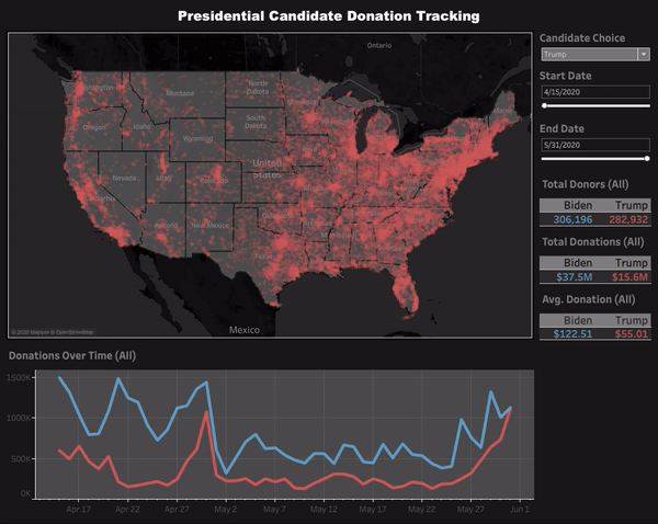
Here’s a look at a dashboard I put together for some Tableau practice. For this one I grabbed FEC data on individual campaign donors to the Trump and Biden campaigns, and created a visual comparing their respective performance by geography. I was actually surprised to see that Biden’s average donation size is quite a bit larger than Trump’s.
Power BI
Now, on to Power BI!
Data
- Power BI also has many data source options available.
- One nifty feature is the ability to connect to an entire folder, which will update dynamically in Power BI as the data in the folder are updated.
- Queries are written in M code, and every change to table is saved in the Applied Steps, which can be individually edited.
- Steps can be renamed so that it’s clear what is taking place when.
- Data types are automatically detected, but can also be edited in the Query Editor.
- Renaming tables to something meaningful should be done early, because table names are used extensively when creating visualizations, so changing them later is a pain.
- If columns are selected in the Query Editor, various options will be presented based on the column type.
- Note that the Transform tab edits columns in place, while the Add Column tab creates a new column. They have many of the same tools.
- Text options: Change case, trim, split, subsetting, return chars before/after a delimiter, select a range, and get the first/last n characters.
- Numeric options: Statistics options return just a single value per table and are used for EDA. Standard tools are applied to rows.
- Dates: Mostly intuitive, but the earliest and latest options return single values.
- Columns can be added based on conditions.
- Grouped aggregations are possible (by single or multiple columns). Columns not in the aggregation will be dropped.
- Can pivot (rows to columns) and unpivot (columns to rows).
- Pivoting will collapse duplicate values, so Transpose is another option to just change the orientation but keep every item.
- Merge in Power Bi is a join. Can merge and overwrite or merge and create a new table.
- Appending is a union for tables with the same structure.
- By default the refresh button refreshes all queries, but it’s possible to turn this off for individual static tables.
- Save changes to tables via Home > Close & Apply.
- More data editing is possible in the Data pane (not Query Editor). Here it’s possible to add new columns, format data types, etc.
Data Model
- Where Power BI really seems to shine is with the Model pane. This is where the data model is created and table relationships established, and it’s quite easy to work with.
- Relationships between tables can be updated by dragging variables from one to the other to establish primary/foreign key relationships, or by right clicking and selecting Manage Relationships.
- Only one relationship between tables can be active at a time.
- Filter flow in Power BI means that filters flow from lookup tables to data tables. So, it’s always best to use the variable from the lookup table in a visualization.
- There are two-way filters, but these can get messy.
Measures & Calculated Columns
- Calculated columns are new, formula-based columns that are added to tables. These are calculated on the info from each row (they have row context). They are statically appended to tables which increases file size, and will be recalculated when data sources are refreshed. They are used as rows, columns, slicers, or filters in a visual.
- Calculated columns are created in the Data pane.
- Measures are new calculated values that are not added to the table itself, but are only able to be viewed as part of a visualization. Since they are evaluated based on filter context, they constantly recalculate whenever the fields around them change. They are almost always used in the values field of a visual.
- All measures require an aggregation function, since they will be reported as a single value.
- Measures are created either in the Data or Report panes. It is important to select the table a measure should belong to, because otherwise it will just be added to the first table in the list.
- Measures can be generated implicitly by simply dragging raw numeric fields into the values pane and selecting the aggregation mode, or explicitly by entering DAX functions. Implicit measures are only available within the specific visualization they were created by, while explicit measures can be used anywhere in a report. Using explicit measures is best practice.
- The course I took said that using spaces in measure names is ok, even though it weirds me out.
- In general, measures are better than calculated columns for performance reasons, so prefer them if possible.
DAX
- Power BI uses a basic, Excel-like syntax for many operations: Data Analysis Expressions (DAX).
- The syntax includes normal arithmetic and comparison operators. The only notes here are that
&is concat for strings,&&is ‘and’,||is ‘or’, and it’s possible to useIN.AND,OR, andCONCATENATEcan only take two inputs, so&&,||, and&are probably better choices.
- To create a new column, just include column name = function:
Weekend = IF(Calendar_Lookup[Day of Week] = 6 || Calendar_Lookup[Day of Week] = 7, “Weekend”, “Weekday”)Short Month = UPPER(LEFT(Calendar_Lookup[Month Name], 3))
- Can nest
IFstatements to create aCASE WHEN. - The
RELATED()function returns the related values in each row of a table based on relationships with other tables (defined by primary and foreign keys). It basically pulls values from one table into a new column of another table. CALCULATE()will evaluate a function if a condition is met. It changes the filter context. Note that it can’t include a measure in this filtering.ALL()removes filters, which is useful for things like the percent of total measures.Overall Avg Price = CALCULATE([Avg Retail Price], ALL(Product_Lookup))
FILTER()returns a subsetted table with rows that meet a condition. It is almost always used with another function.FILTER()is slower thanCALCULATE()but can use measures for more complicated expressions.- Iterator functions loop through a given calculation or expression for each row of a table, and then apply some sort of aggregation to the results.
- These functions end with X.
Total Revenue = SUMX(Sales, Sales[Order_Qty] * Sales[Order_Price])- This will multiply Order_Qty and Order_Price for each row of the Sales table, and return the sum of that.
- Iterator functions are expensive, so use sparingly.
Reports
- A single report can have multiple tabs.
- Creating visualizations is similar to Tableau with the drag-and-drop functionality. However, many things need to be adjusted by clicking the element and switching to the formatting pane (the little paint roller). This includes formatting by color, adjusting titles, etc.
- Reports have four filter types:
- Visual level, page level, report level, and drillthrough (which applies to specific pages, and dynamically changes based on user paths).
- Filters can be added by dragging the appropriate variable onto the filter pane.
- Can control how filters work with different visualizations by selecting the element being used to filter > Format > Edit Interactions. By default it will be set up to filter all other elements, but this can be adjusted. Every piece of content has interactions with every other one that must also be adjusted. Can choose to filter or highlight from here as well.
- Note: Totals are not calculated from the rows above them, but are based on their own filters!
- Parameters can be selected using the Slicer visual.
- Create parameters on the Modelling tab of the Report pane. This creates a new table and measure. Use this new parameter measure to create another new measure that uses its selected value.
- Can add Bookmarks that link to a particular view, and roles so that certain folks can only see subsets.
- Lots of additional open source visuals are available for download.
- Phone and desktop layouts are available. Build in the desktop layout and switch into the phone to reassemble and check.
AI Visuals
- Power BI has introduced some cute and modestly useful AI visuals. These include an option to write a question and get a visual (e.g. “what is the best selling product?”), feature importance using linear and logistic regression, segmentation, and decomposition trees.
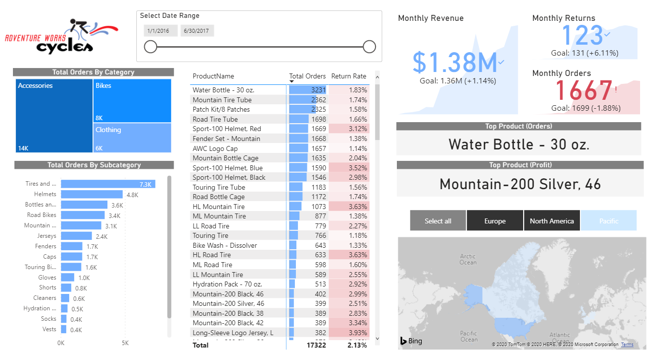
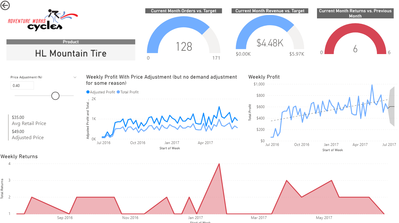
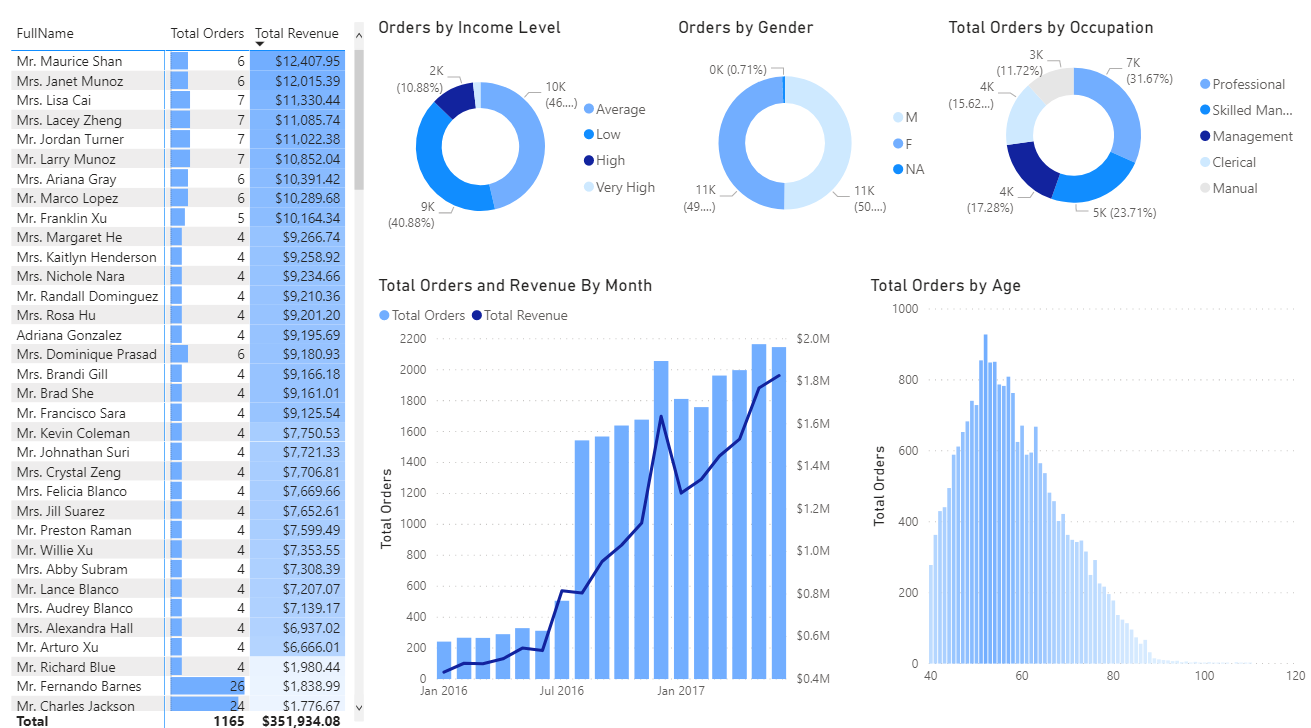
Overall I found Power BI to have a less aesthetically pleasing interface than Tableau, but to be more user friendly once I figured out where things were. I have not yet put together an original dashboard, but here’s a look at the one I did alongside the course I took (with some minor adjustments):
Best Practices
It seems most dashboard best practices are quite intuitive. Still, some quick notes:
- Pay attention to the intended audience. Executives need high-level KPIs, while managers may need to be able to drill down for further detail.
- Tell a story, and explain the context for metrics. Knowing that 74% of items were delivered on time is not useful without context for whether this is a good or bad result.
- Start with an overview and drill down into further detail.
- Keep design minimal, and use the appropriate graphs and colors vs. getting fancy.